Almost there...
Building an AI-Powered Marking Tool
February 2025
Project Brief
Evaluate Learning is an EdTech startup focused on providing students with detailed, personalised feedback on their homework. At the core of this solution is an Automated Marking Tool powered by cutting-edge AI technology. Our team consisted of the founder, who oversaw all aspects of the project, an AI model developer, and myself as the frontend developer. My role was to bridge the gap between the AI system and the teachers using it in their classrooms. This project's main goal was to build an MVP for teachers to trial.
This web application marks the first client project that I have completed. I was hired as the lead frontend developer and was responsible for creating the minimum viable product for this startup. Speed was key, and functionality was of the highest priority. I was told that the UI/UX should not be polished, but rather sufficient enough for the prospective clients to use the product with ease.
Background and Research
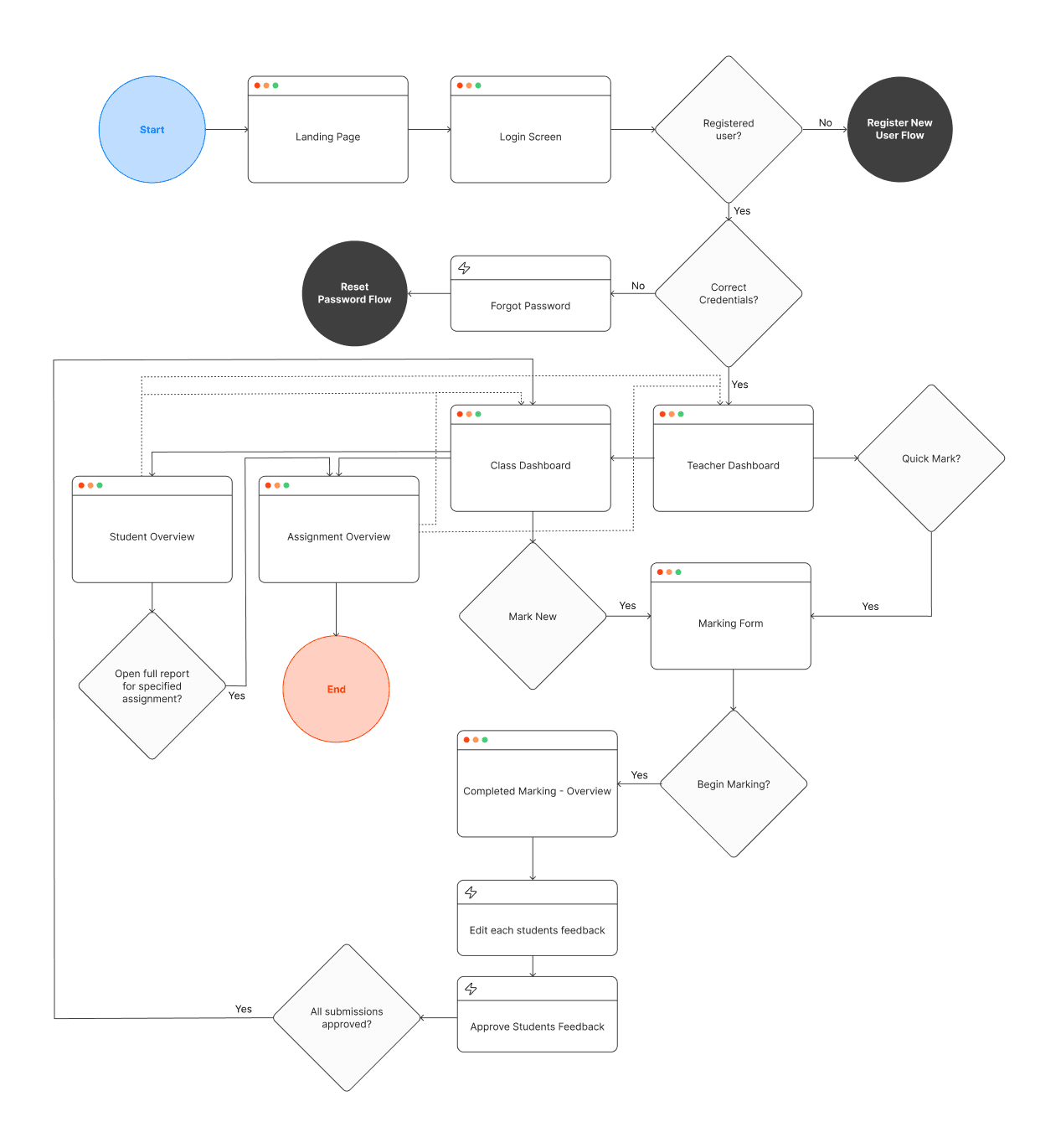
Before writing any code or designing in Figma, I focused on fully understanding the product. I used existing online marking tools such as Co-Grader and GradeWiz, with similar user journeys to get an insight into the core functionalities, of which I have outlined below:
Teachers needed the ability to upload student homework in PDF format. Upon submission, the AI model would generate detailed feedback for each student’s work. The teacher would then review and approve the marks before finalising the grading process.
Key functionalities included:
- Login: Teachers should be able to log into their pre-registered accounts to access their class & student data.
- Submission & Feedback Review: Teachers upload homework, and the AI provides initial marks and feedback.
- Approval Process: Teachers review and approve AI-generated marks before they are finalised and added to the database.
- Dashboard Navigation: A centralised dashboard displays all classes for the logged in teacher, allowing teachers to access each of their classes dashboard.
- Class-Level Insights: A dashboard displaying class level data such as average grade, students performance, attendance, etc. A full student register with recent grades and the option to see more.
- Student-Level Insights: Each student’s marked assignments can be reviewed individually, showing student trends.
Building Blocks
When I joined, there was an existing extremely draft website that the founder had created quickly, just to get something started. The website was written in React using a NextJS framework, strapped with Tailwind CSS and Typescript.
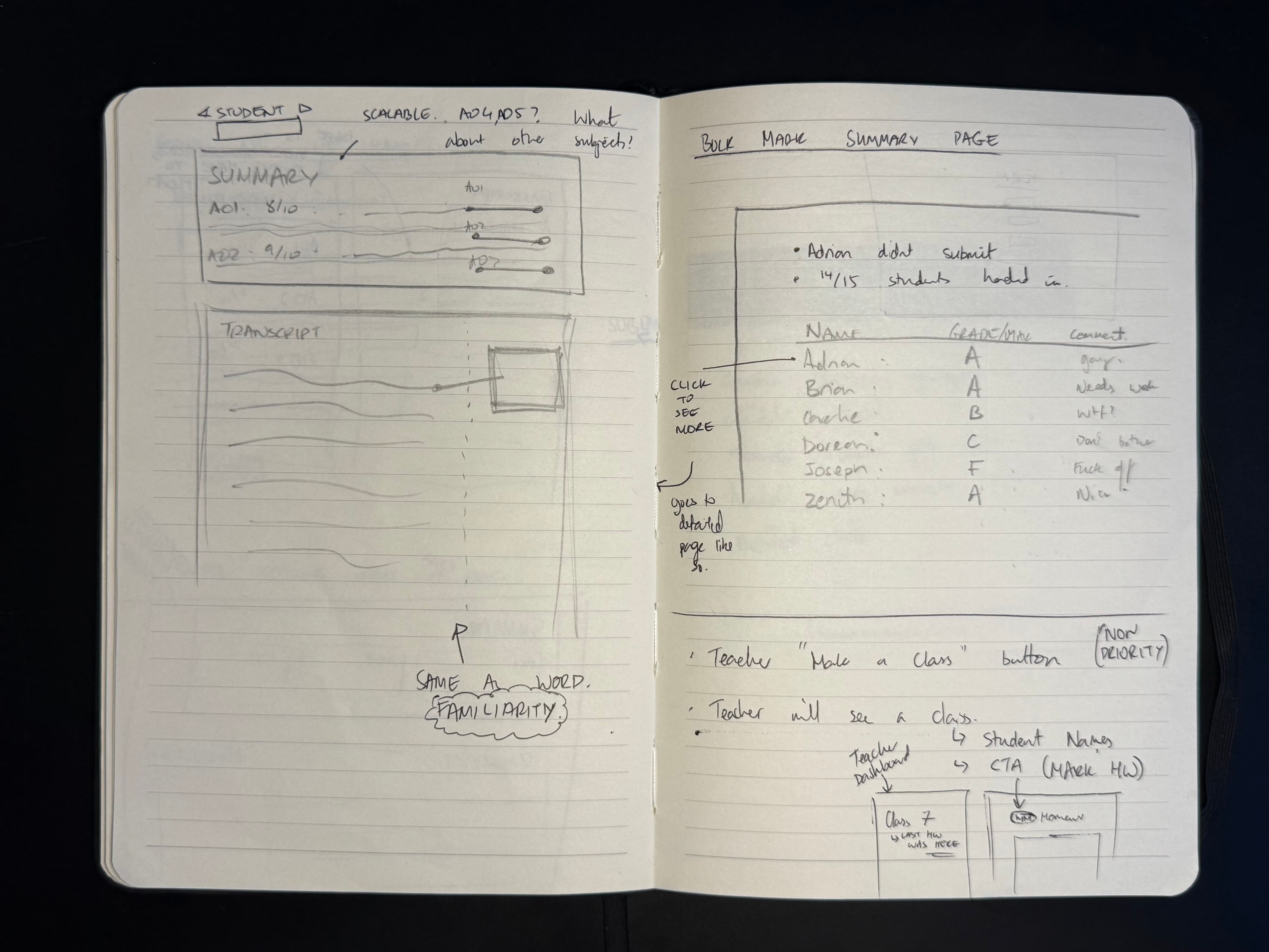
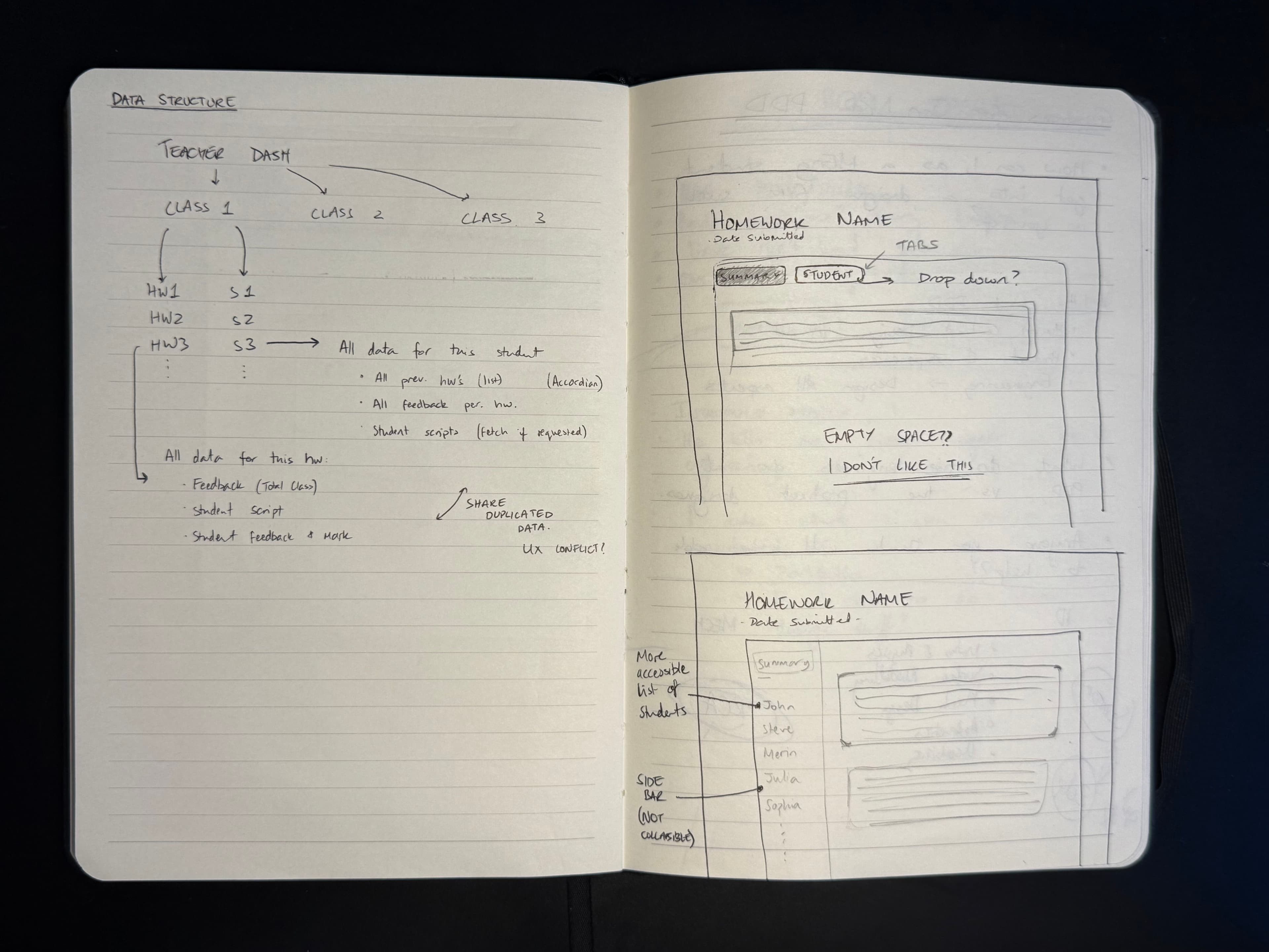
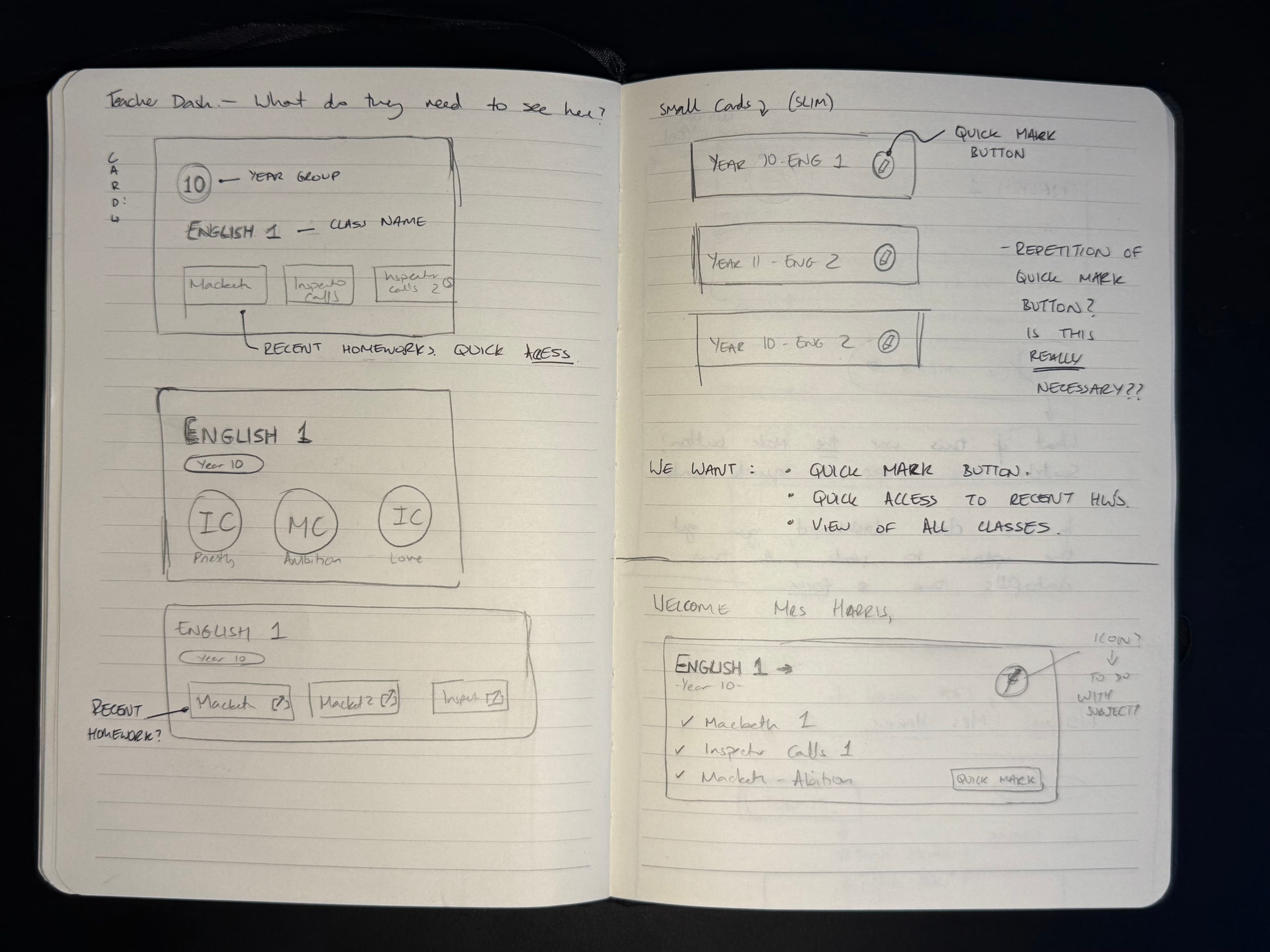
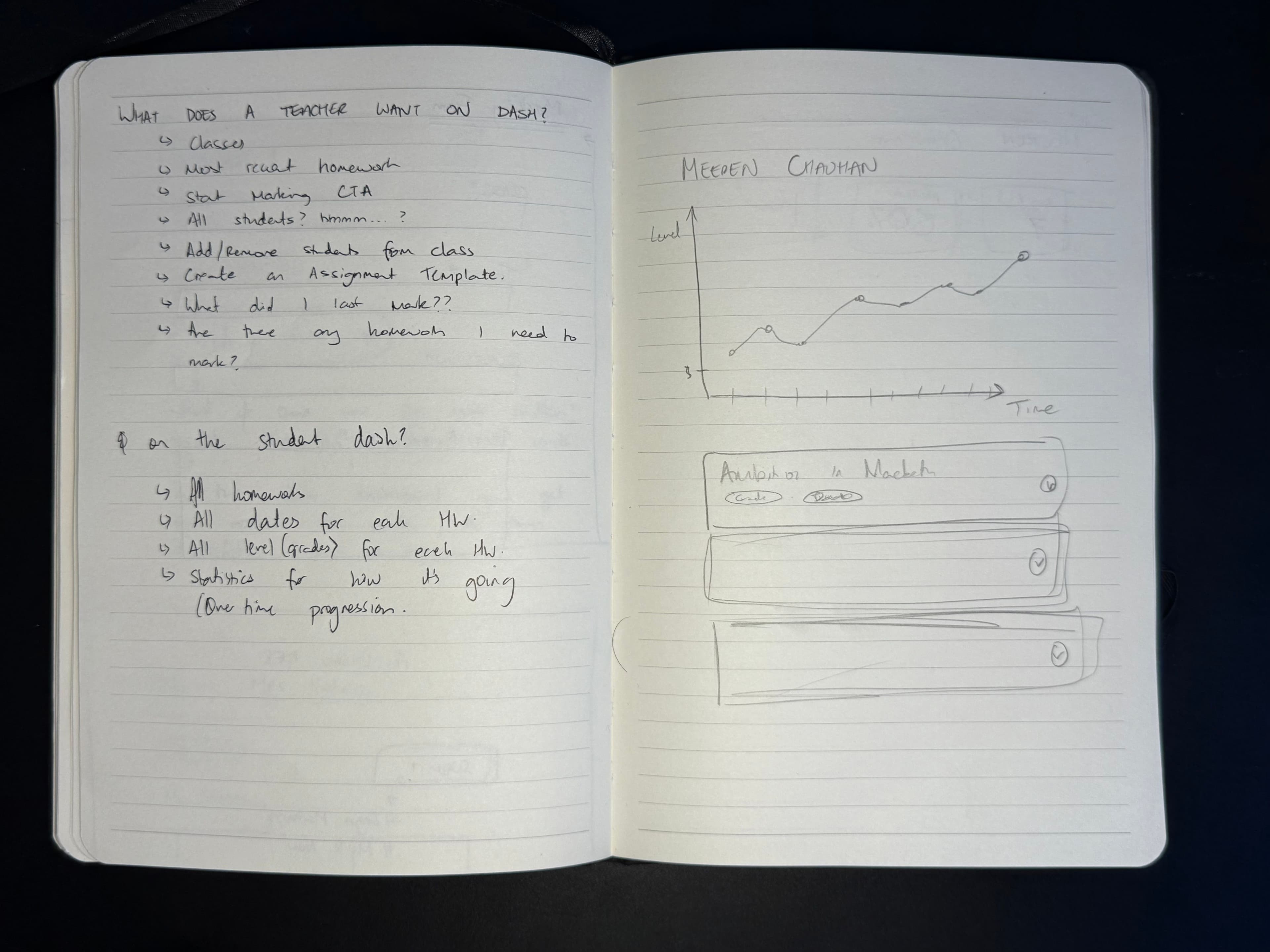
Building on what existed, I started some sketching and brainstorming to flesh this application out a little bit more...
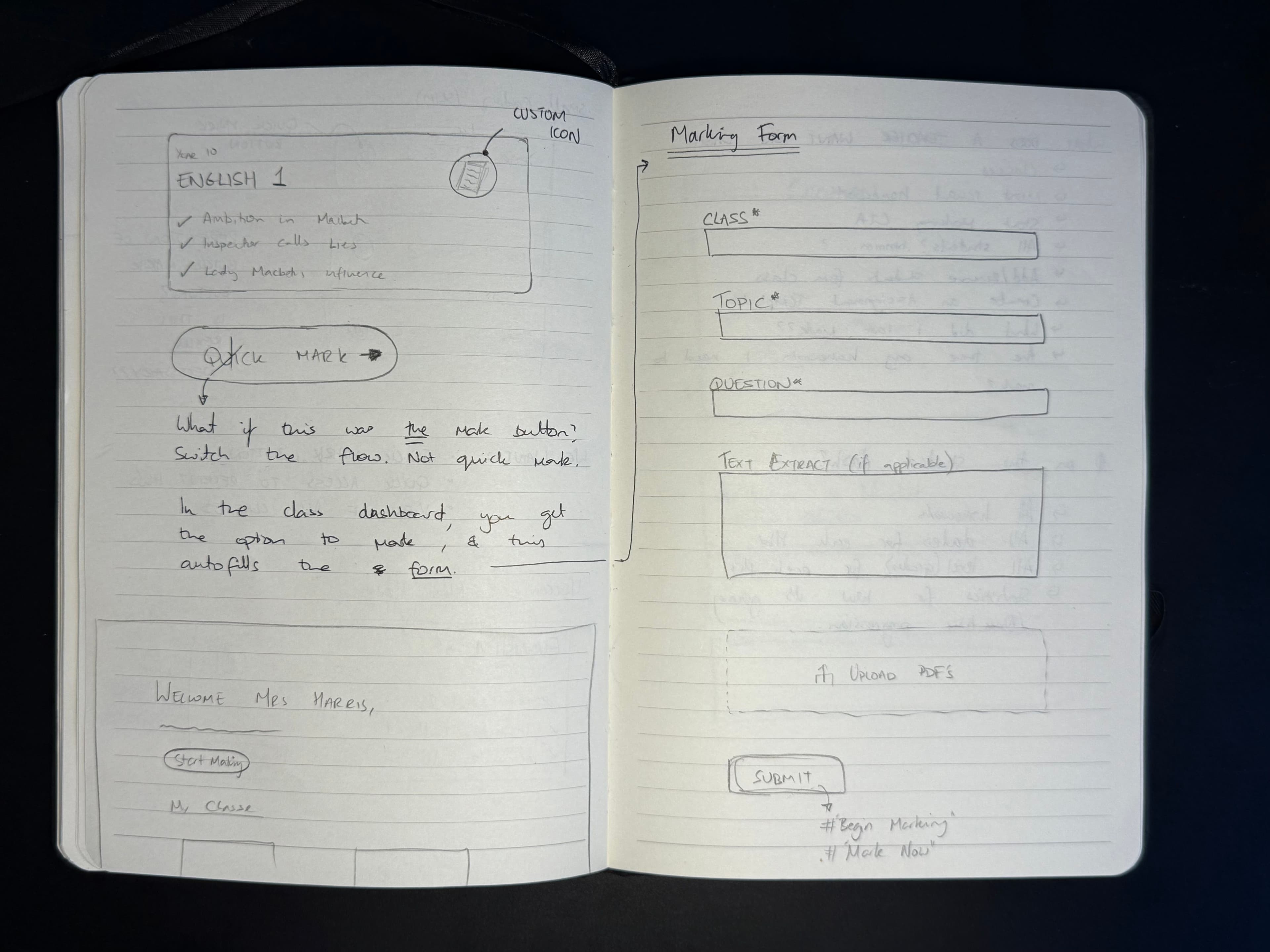
Then, I got myself into Figma to get a better idea of the design language. I played around with the amount of accent colour to use, the spacing, and icons. I ended up using Lucide icons for this project.
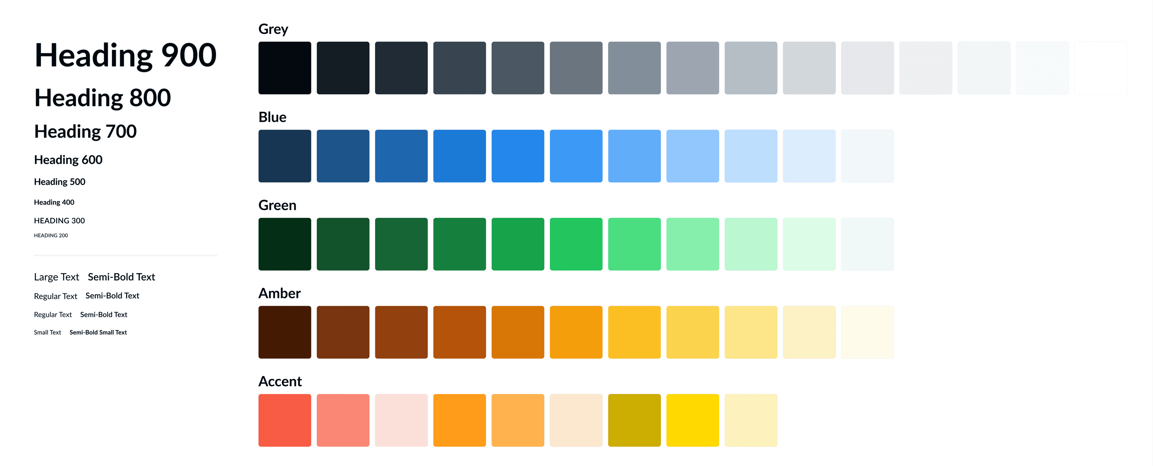
Colours and Typeface
The client had already established an accent blue colour in the logo, so I made the pallet around this using the interesting technique explained in this video. Whilst the draft typeface was in Google's very basic Inter font, I eventually switched to Lato, giving the website a little more of a personality with a slightly unique typeface.
Final Proposal
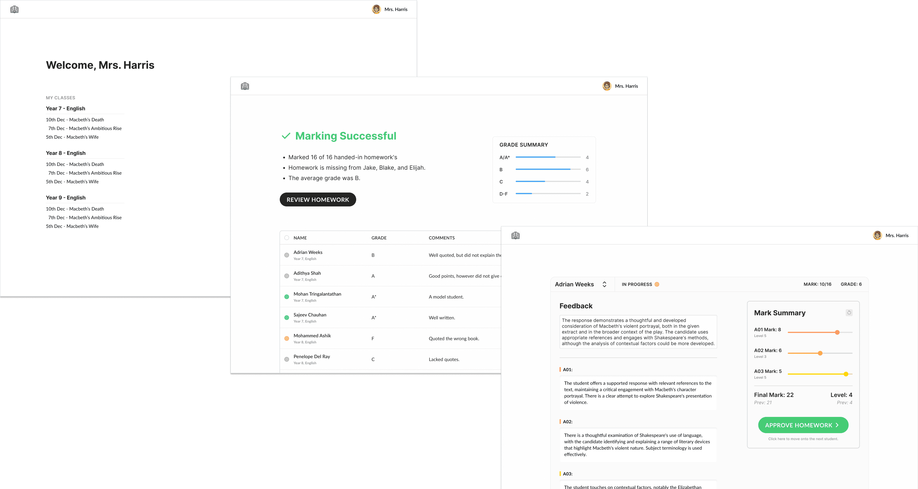
After a few weeks, the MVP design was finalised and implemented into the frontend. Below, I have shared my designs of the Teacher Dashboard, the Class Dashboard, the Student Dashboard, and the Assignment Review page.
The Teacher Dashboard is the landing page after the user signs in. The upper half of the page contains two important CTA's with appropriate hierarchy, alongside the recent history. I put these at the top as it is most likely what the teacher wants to do when logging onto the application. Below that, the teacher has a searchable tile-list of all their classes with recently marked homework within each tile.
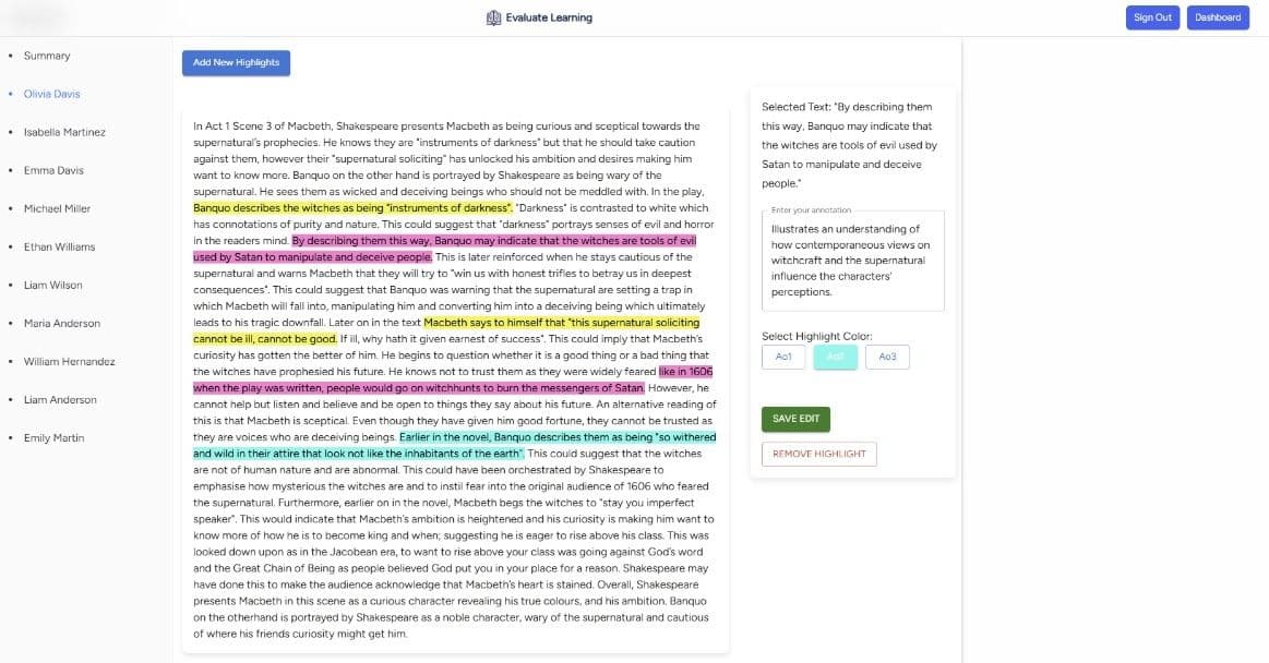
The Review Page is the page that the teacher is directed to once the automated marking model has completed its task. The key statistics of are shown immediately, with a summary graph showing the performance of the students. An AI-generated summary is displayed beside each student's grade and mark in the table below.
Navigating using the sidebar, each of the student's marked response can be reviewed. The written feedback is editable by the teacher, and the marks are easily adjusted using the sliders, as seen fit. Teachers are also allowed to annotate the written response, assigning a specific Assessment Objective (AO) to it. On the sidebar, the status of the student's response is communicated through an icon.
The Class Dashboard has two CTA's in the header, with a dashboard of key insights just below. Teachers can easily access their recent actions for this class, and get a good overview of how the students are performing. Each student is clearly displayed in a clickable table at the bottom.
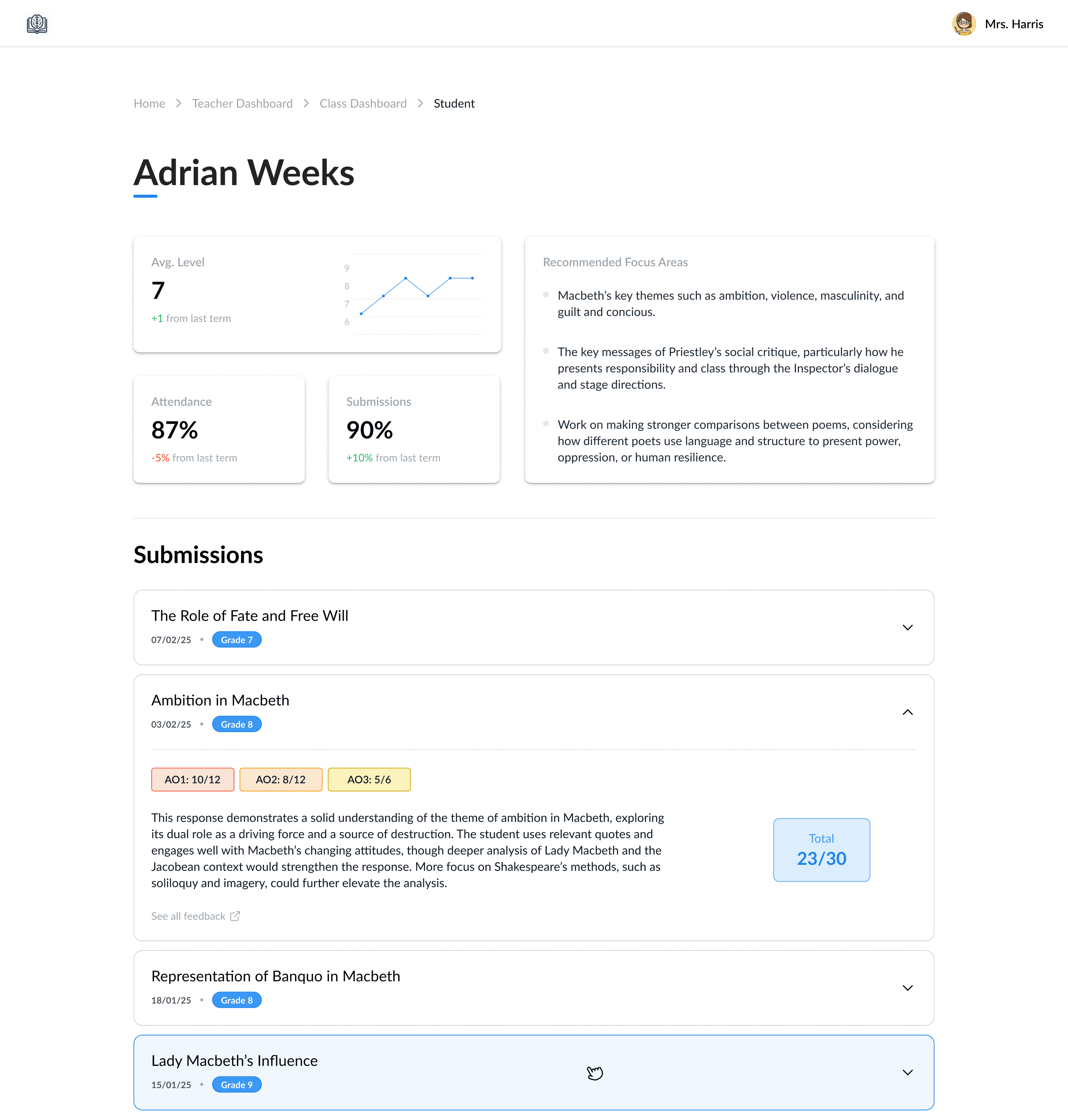
The Student Dashboard is a student-level breakdown of their recent performance under this teacher. The AI-driven insights are shown in the "Recommended Focus Areas" and the key metrics are displayed in a tile format. An accordion is used for the recent submissions, each giving an AI-generated summary of their feedback.
Production
The designs showcased above were fully developed and deployed using Vercel. Since then, the web application has been taken down for further upgrades as part of the next phase of development. Evaluate Learning has chosen to keep the upcoming steps confidential.
Working with Evaluate Learning was a fantastic experience—the team was great, and I gained valuable insights, particularly in backend development, while working on a client-facing project. I’d love to hear your feedback, so feel free to share your critiques!