Tutoring Website
To help grow my tutoring business, I wanted to code a website from scratch for potential clients to visit. There was an issue however - time. When I started this project, my plate was full with uni work, job applications, several other side projects, and my gym training. The thing with me is, if I want to do something, I’ll find a way to do it, and so I came up with a solution.
I turned this project into a challenge - a sort of design sprint but instead of designing, I’d develop the entire project from scratch within a chosen time frame. This was a very simple website. Very static, nothing moving. I gave myself twelve hours. I’m sure a pro could whip this up in under three but considering this was my second ever deployed website, I thought twelve hours would be challenging, yet achievable.
12 hours. Blank canvas to a fully deployed site. Let the challenge commence.
This hour was about quantity. To be as quick as possible, I used the same framework from my personal website - a NextJS framework with a Sanity CMS integration. This was the setup I was familiar with, and it worked well as the Sanity integration would allow me future proof this website and easily change items without having to dig out the source code.
It was here where I decided the fundamentals of the project. I decided to design mobile-first as I thought this makes the most sense from the developer point of view. Since time was limited, there was point trying to design the UI in Figma - instead I just designed on the fly. This was an exercise of pure spontaneous artistic expression.
I quickly put in the first three sections that I thought were the most relevant: A Hero section (what), an Attribute section (why) and an Offerings section (how). In a more 'proper' project, I would have coded each section in a separate file for best practice, however all that jazz was not needed for such a small website.
Here I implemented the fundamental design pillars. I started with the colour palette - this was easy. I loved the Blue, Orange, Black, and White palette that I had made for my personal website, so I took that and ran with it. Although it was the same colour palette as my personal website, I was going to use it in a different way - at the end of the day, I didn’t want to build a boring duplicate of my personal website. All I had to do was use the colours in a different manner. Instead of the blue and the orange being subtle accent colours, I brought them to life and make them the big feature colours. I chose the blue as the main header colour, and the orange as a feature background colour. I think it worked well.
Font face? Montserrat. I am biased - it is my favourite font and I wanted to keep it consistent with the main site so I chose it.

I wanted to use black, white, and orange for the background colours, however it looked very odd just simply stacked on one another. I needed to tweak it slightly and add a bit of a twist. I had an idea of a diagonal sections but instead of them all rotated in the same direction, I wanted them to be alternating so it looked like the sections were tessellating. This took some time to research and implement, but after finding a few helpful YouTube videos, (here and here) I was able to implement these within a few hours, including the styling.

It was time for a quick clean-up. In the first four hours I basically just vomited all the information and bulk code into the file so a little housekeeping was needed. I finally decided on the background colours and the title colours. I also spent some time creating a multi-sized heading. I felt like the increasing text size gave it some personality but also made sure to communicate the main information to the viewer. Combining this with contrasting colours in the blue and black, really pushed the ‘MATHS’ and ‘PHYSICS’ title headers to the viewer. Cool.
I also spent an hour or so setting up the Sanity integration. Here I added the full desk and vision tool functionality. I created a quick template schema for the Attribute List and the Hero Section just to test the data fetching was working as expected.

The goal in this session was to round out the final three section and get them into sanity. I had to start by creating the Sanity schemas for each section and then writing the content for each part. As I was adding these details in, I was also designing how exactly this information should best be laid out. These went hand in hand. For example, I wanted the attributes to be in bullet point form, therefore it made most sense to create an array within the Attribute schema which I could iterate over when rendering the content.

This quick 30 minute session I spent making the site responsive. Since it was mobile first design, it looked horrible on screens larger than 768px. This was a simple job of increasing the gradients of the separators, font size and the spacing of different modules.
With 4 hours left to go, I was sure I could finish this off easily. The website was ready to launch however I thought it would be more fun to add a few extra bits to spice things up in my remaining 3 hours. I’d leave the final hour for deploying
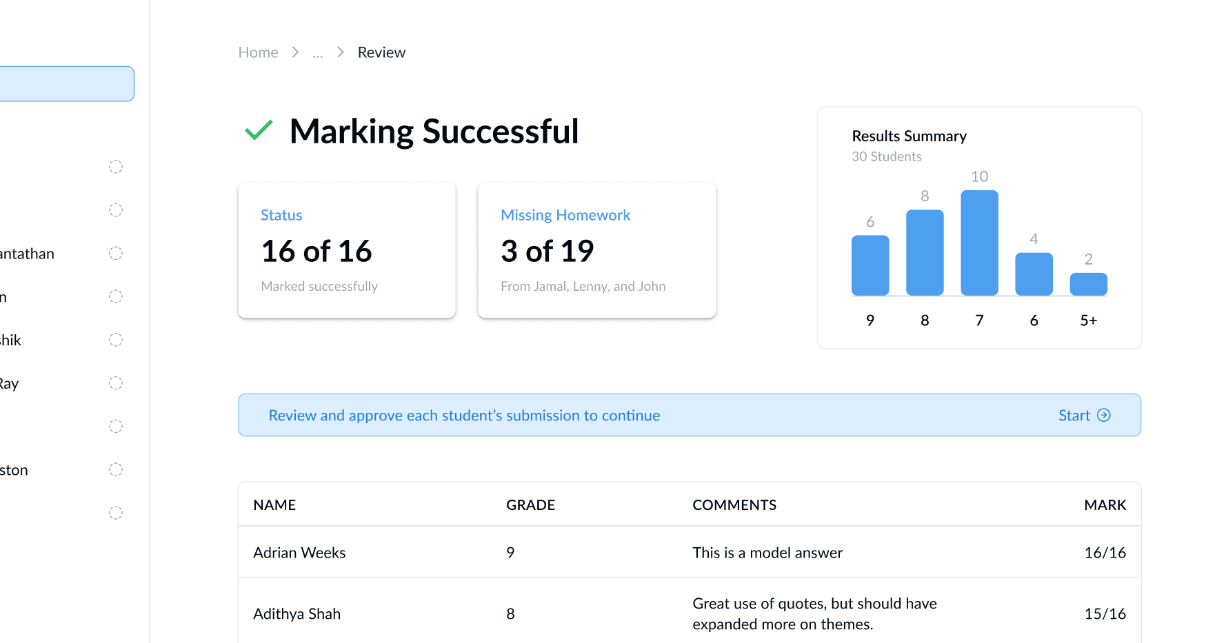
I thought some illustrations would work. Oh, and also a little teaser of what my digital notes could look like.
So. First thing that popped into my head was a pencil. Good old pencil. I created up a quick sketch in Procreate on my iPad, and then moved onto the exemplar digital notes. I thought it would be best to make 2. At this point I had the vision of stacking the two papers on top of one another and spread like a deck of cards. Once again, due to the time constraints a lot of the design was done in my head, at whatever came to me in that moment. At this point I learned something about design - It’s about trusting your skills. The better you get, the more experience you have in design, and the better your ‘initial’ and intuitive ideas will be.
Polishing. Now was the time to get the content correct, add the new image assets I’d created, make it fully responsive, and add a ‘mail-to’ link to the email address.
Originally, I was going to add each of the example notes images individually to the website as <Image> tags, however I quickly realised to get the arrangement I wanted (both rotated and sitting on top of one another) it was much more complex than I imagined. From rotating them, to positioning them absolutely, to them also being responsive - at my skill level, I didn’t know a quick way to do this. Instead, I went into Figma, grouped the two photo’s with the correct layout and orientation, and then simply saved that group as a single image. Now, all I had to do was add a simple <Image> tag between the attributes section and the pricing section. This was a quick, simple and effective solution.

I’m so glad that I left one hour for the deployment. All I had to do here was to create a subdomain called ‘tutoring.meerenchauhan.com’, and add link this to my new deployed Vercel project. Vercel makes it so easy that I was deployed in less than 10 minutes. After I deployed it, I did some testing and found a few bugs in the styling of Attributes section, which I quickly corrected.
12 hours. Times up. Challenge complete! A new website added to the list, and which will hopefully help gain some more clients for my tutoring business!

There were two major things I took away from this project. Firstly, projects don’t need to be huge, spectacular, and super complicated to be great. I think this is one of my better projects, even though it was probably my simplest. I just let it flow, and that brings me onto my next big lesson. I usually spend a lot of time on design — iterating, and exploring different paths. In this project, I pushed myself to just get a design going - do whatever felt good in the moment and run with it. Do not overthink it - this is definitely one of my weaknesses. I was pleasantly surprised with what I came up with. To be honest, I was not expecting for it to look as good as it did. I always felt like good design had to come from hours on the drawing board. Nope! Sometimes you get lucky, and sometimes designs don’t have to be the ‘best’- sometimes being ‘mediocre’ is actually the best look for your particular project. There is nothing especially great about my design - in fact, there is nothing even remotely ‘cool’ but it works well together which actually elevates the entire website to make it seem nicely designed.
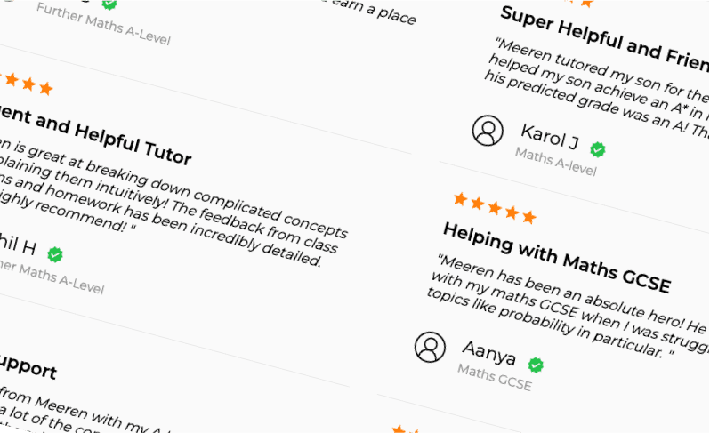
After release, I had some feedback that one of the bullet point lists looked like drop down arrows, and when clicked, nothing happened. Clearly this was due to a lack of my UX design experience but I am glad that has been pointed out. A mistake I hope not to make again. I would also love to add a customer review section at the bottom of the website - a job for when I have a bit more free time.
Thanks for reading, that was pretty fun!


